
- Agency // Client
- Own Art
- Year
- 2017
- Platform
- Web
- Our Services
- Art Direction, Design
Brand evolution of learning specialists, Atticmedia
Atticmedia is an award-winning learning and communications agency. Since 1996 they’ve been creating impactful learning tools for clients including PwC, M&S, Pearson, Johnson & Johnson, NHS, BBC and many government bodies.
Their approach to learning is innovative and crafted – bringing fresh ideas and creativity to each new brief. They needed a brand that reflected their style and ethos of ‘crafted digital learning’.
The brand
The Atticmedia brand has always worked hard to keep its roots firmly grounded in its humble loft-based beginnings. It’s a metaphor for starting small, doing stuff well and, no matter how much you grow, remembering where you came from.
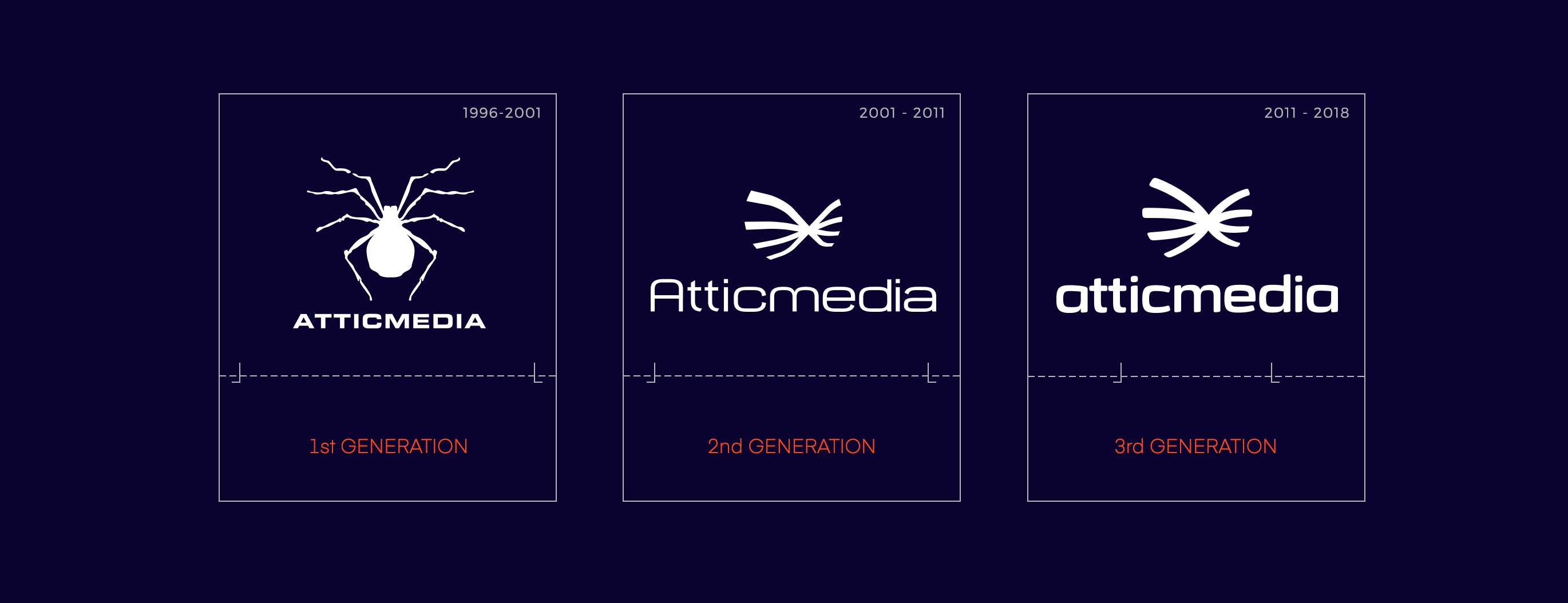
Throughout the 22 years, Atticmedia have been in business, their brand has evolved through multiple iterations, but it’s always been represented by the Atticmedia name and the same brand marque of the spider – something you’d find in most attics the world over.
Our Approach
We worked closely with Brightwave to help capture the course content visually. This involved tailoring the design style to the traditional Diageo look and feel, but also giving it a fresh twist that made the experience unique.
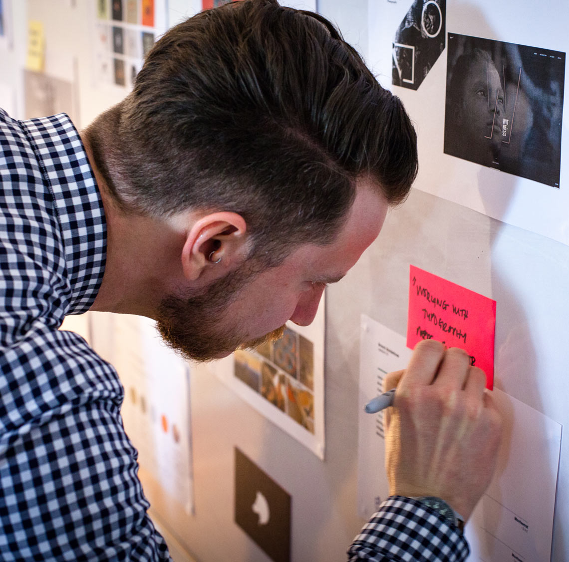
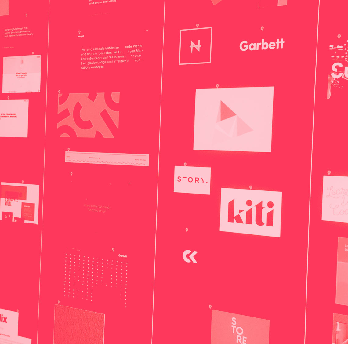
We kicked off with a round of visual research, which allowed us to collaborate with the team and create a shared vision through a series of workshops and discussions.
Evolving the brand marque
The existing brand marque had evolved over a period of 15 years, and the current iteration had been in service for over seven.
The accompanying brand palette was also starting to feel tired, with a predominantly dark and inverted theme. The spider symbol was also heavily adapted to compliment the typeface in use, which the team felt looked too dated for their new, more refined direction.

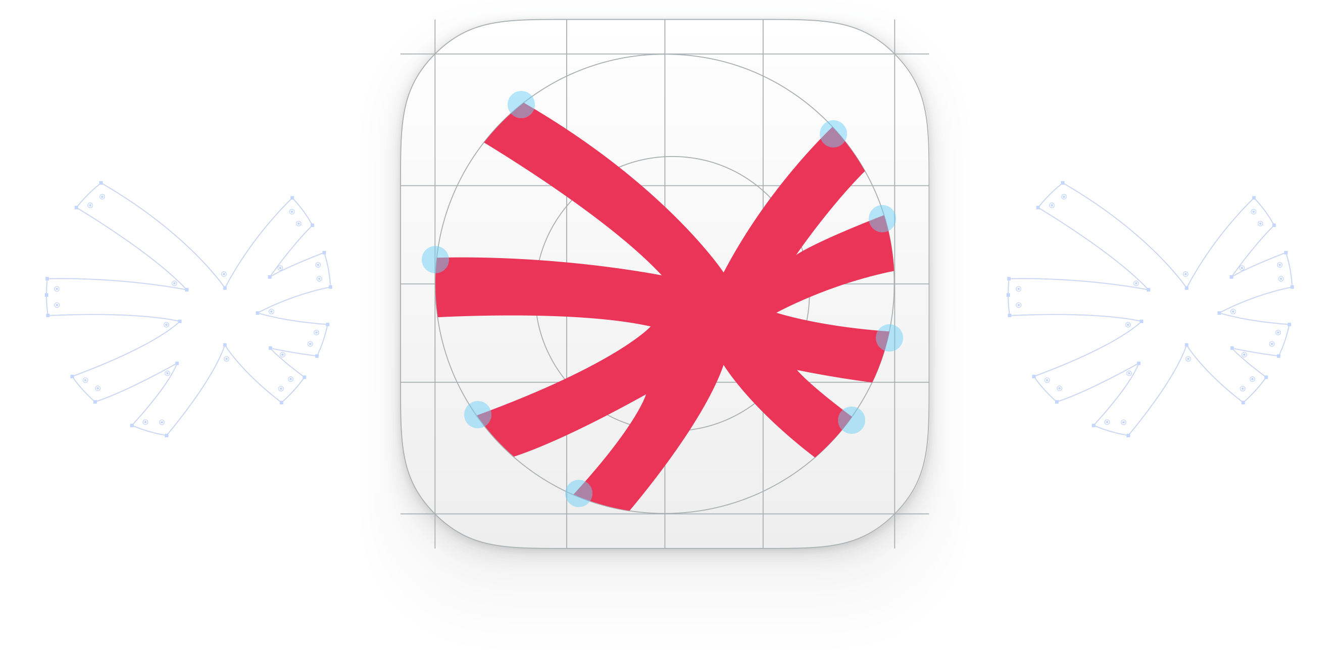
Evolving the brand marque
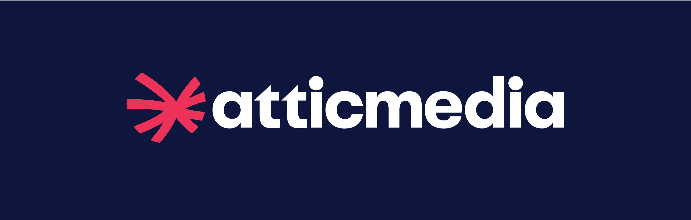
We took the established shape and crafted it to become bold and modern while tying in with the accompanying typeface. The result was a refined version of the marque with a contemporary feel.
The effect is subtle, designed to work alongside strong fonts with a simple accompanying palette.
The Result
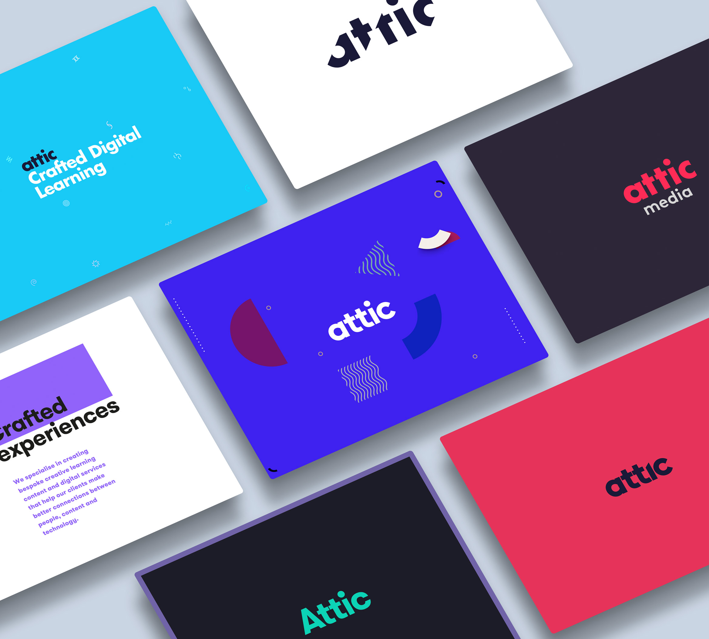
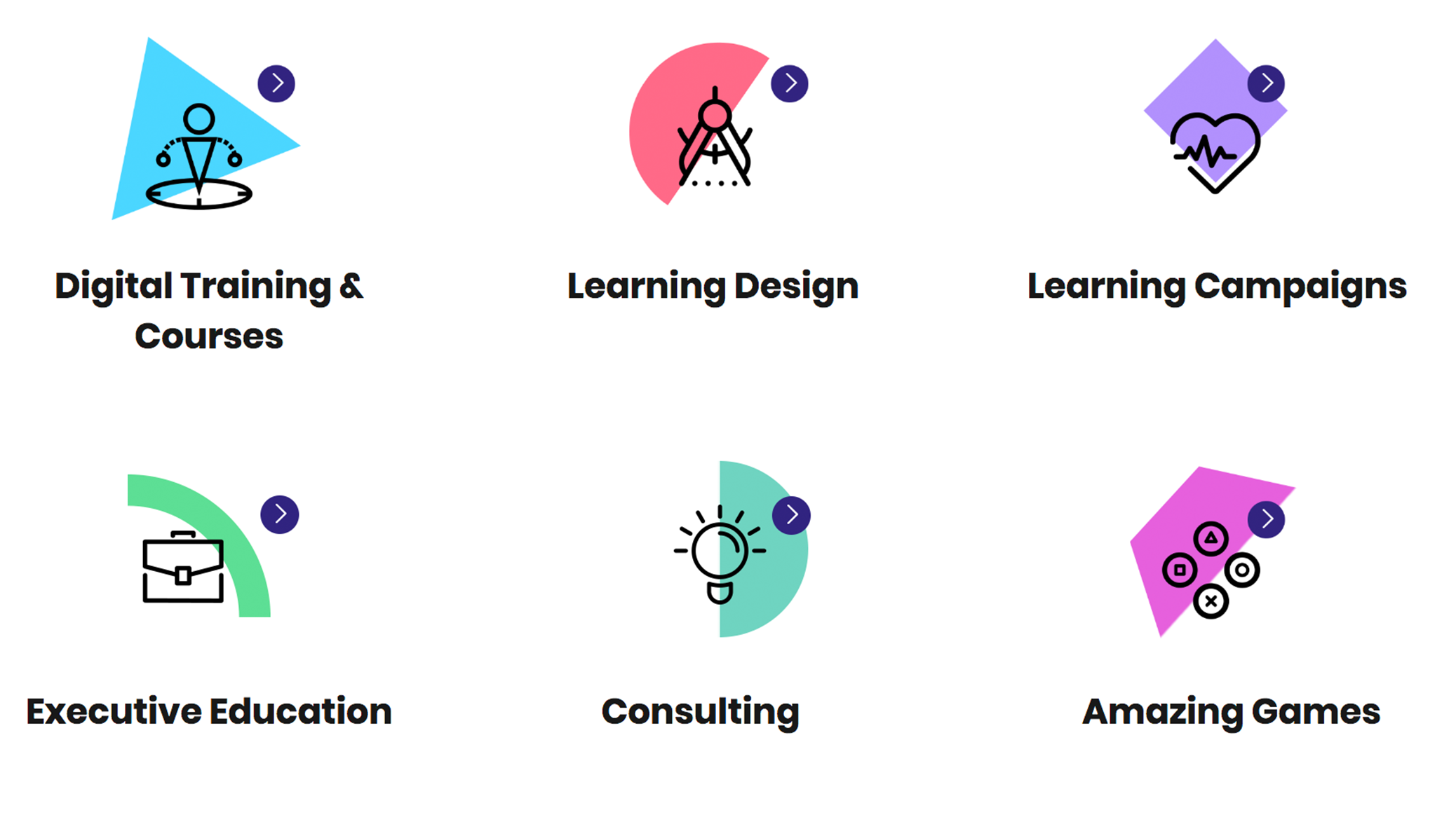
We created a modern look and feel for the brand evolution which incorporates a fresh colour palette, refined iconography and premium imagery. The end result is a look which feels true to the company’s history while being different enough to compete in today’s highly competitive marketplace.
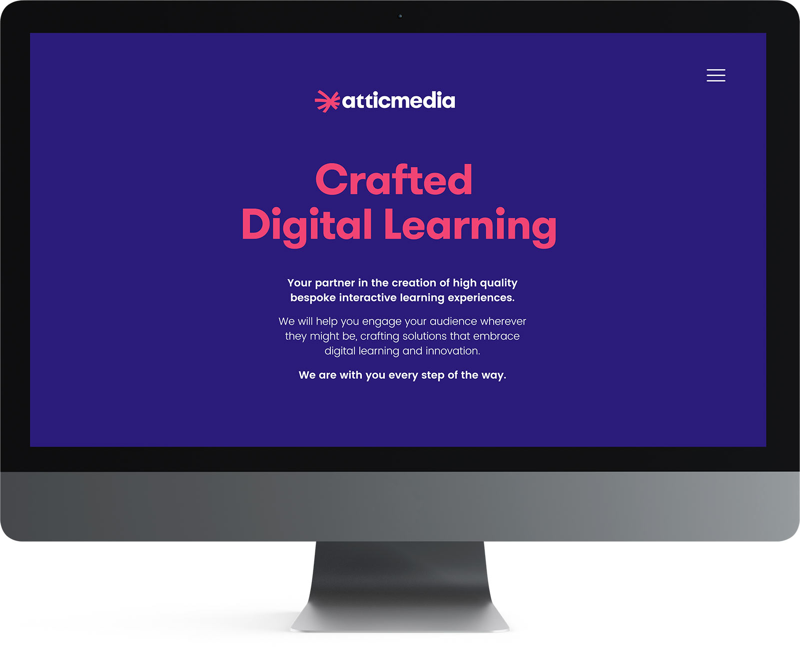
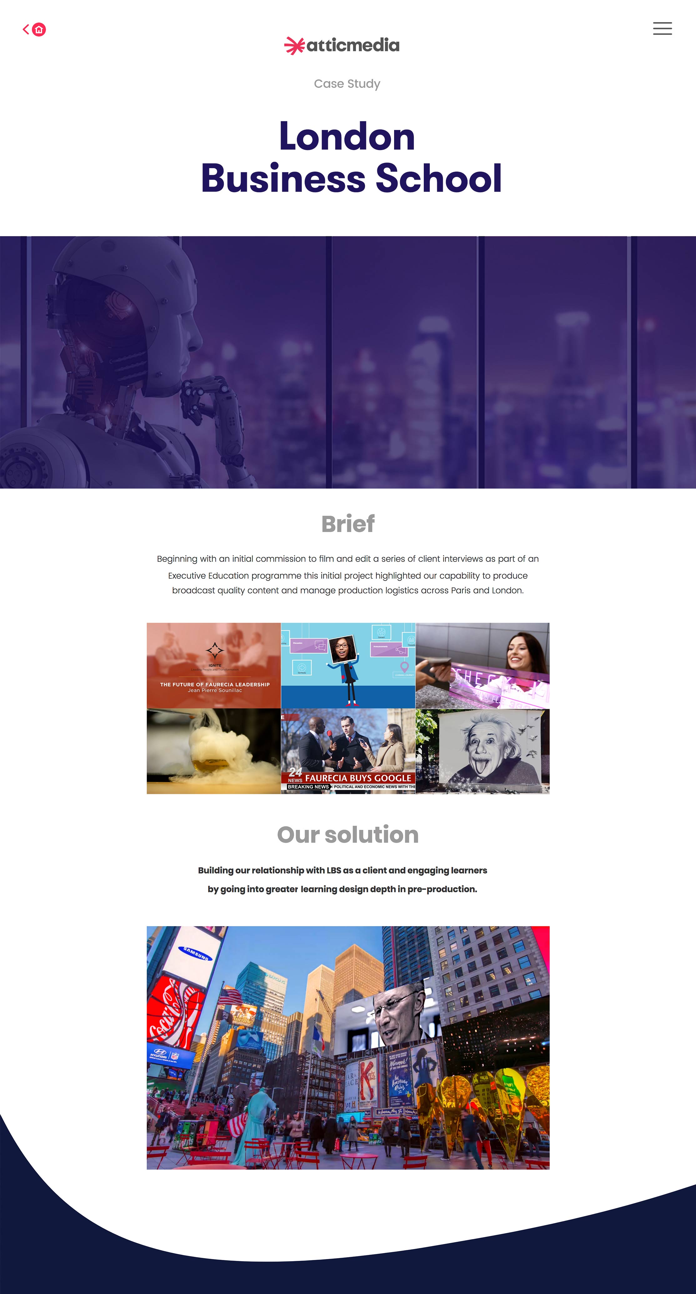
We rolled the new branding out via internal design guidelines and online on the Atticmedia website.
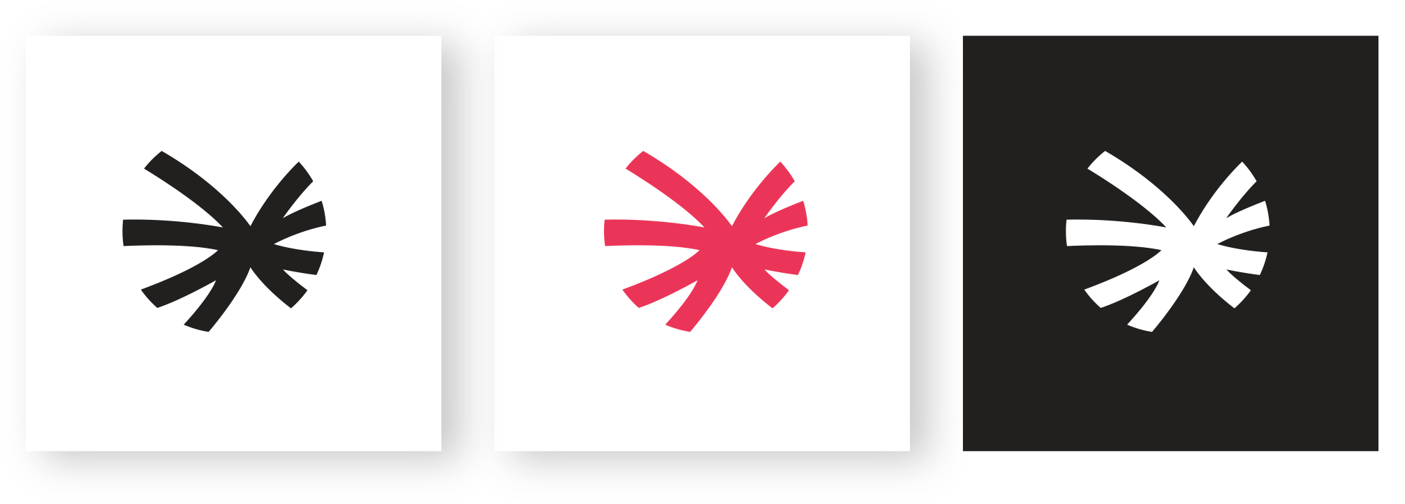
Brand Marque
Custom Logo Type

Combined Elements

Service Icon Set
Launching the brand
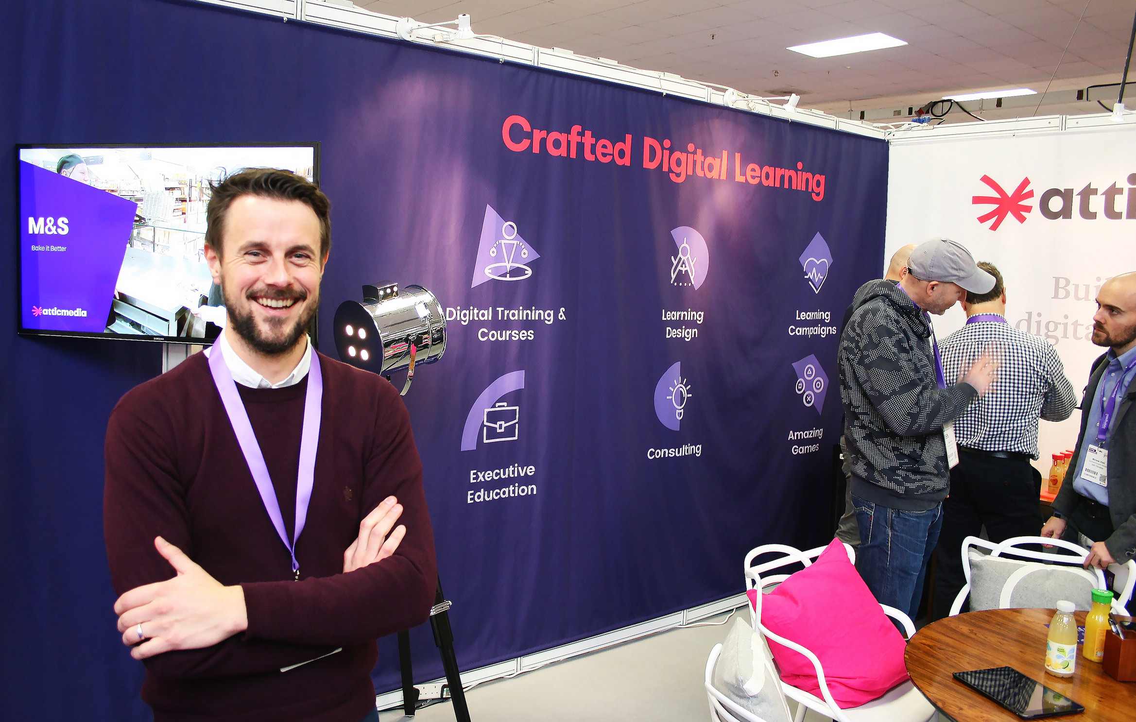
Atticmedia wanted to launch their brand evolution at the Learning Technologies Conference 2018.
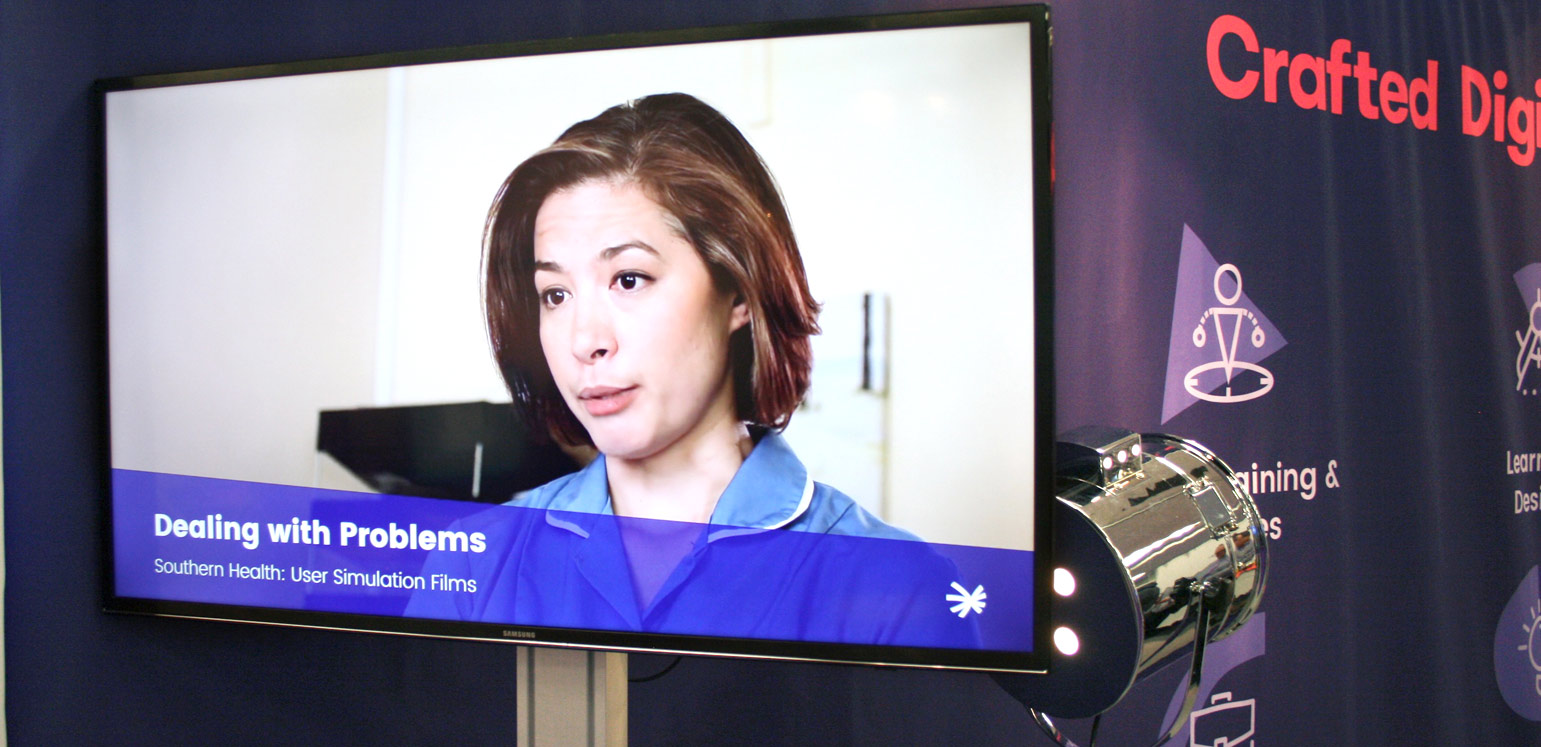
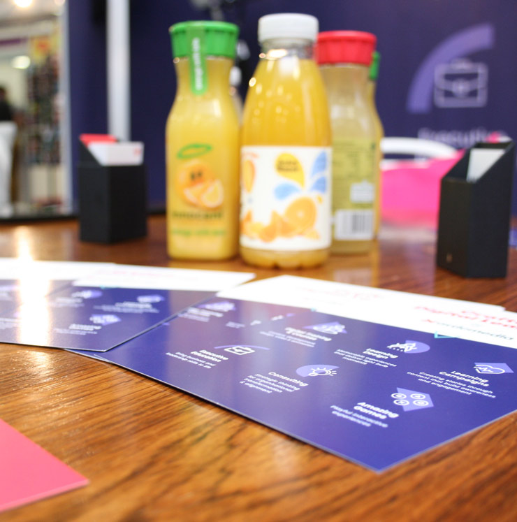
We worked closely with the team to create a stand which showcased their updated visual presence, helping them stand out among competitors with their simple message and unique look.
Wolfcub have endless energy & brilliant design skills, they're a joy to work with. We have a great ongoing partnership with them.
Carl Draper- Managing Director, Atticmedia