
- Client
- Space Doctors
- Year
- 2015 / 16
- Platform
- Web
- Our Services
- UX, Design, Development
Defining cultural insight for global brand consultancy
Space Doctors are a globally-recognised brand consultancy. Fuelled by the very best of cultural and semiotic insight, they help the world's leading brands connect with and respond to ever-changing cultural trends. Their impressive client list includes Gillette, Diageo, Cadbury, Intercontinental Hotel Group, Lipton and Tesco.
semiotics (noun)
the study of signs and symbols and their use or interpretation.

Purpose
When we met, Space Doctors were going through big changes in terms of their overall brand essence and the way they positioned themselves among their competition.
Their existing website was difficult to navigate, bloated with academic content and didn’t accurately reflect the cutting-edge organisation they’d become.

Our Approach
Historically, the brand had been used mainly for print-based materials, drawing inspiration from the radical Bauhaus movement. We worked closely with Space Doctors to capture the spirit of their brand within a digital context.
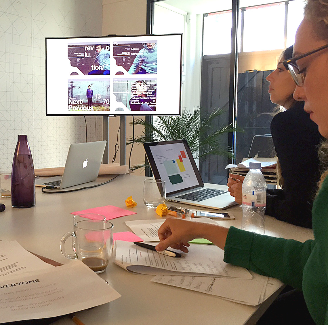
As well as translating and evolving their visual style for a digital-first approach, we ran a series of collaborative workshops and sessions to get to know their brand, vision, messaging and ethos.
Challenges
The biggest challenge for Space Doctors was getting their clients to understand the value they can bring in an accessible and easy to digest way which reflected a radical shift in their brand's visual style.
Not only did they need to explain their own services clearly, but there was a need to help educate visitors around the field of semiotics research as a whole.
Building a style
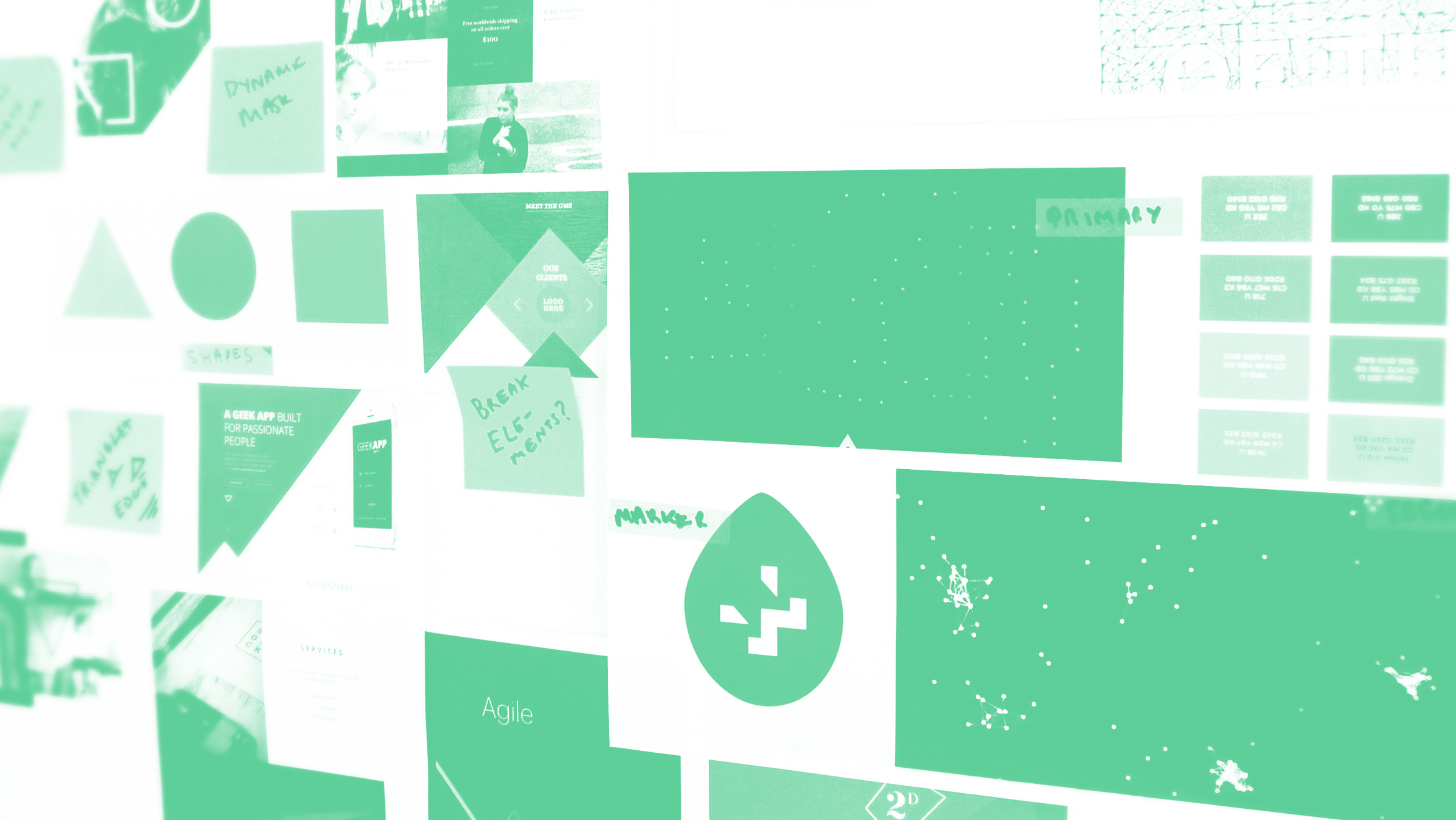
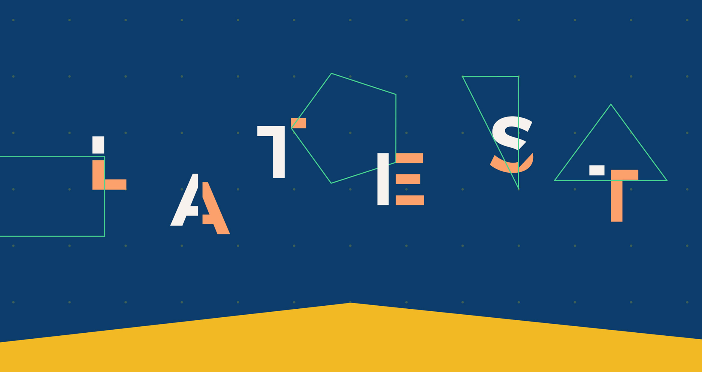
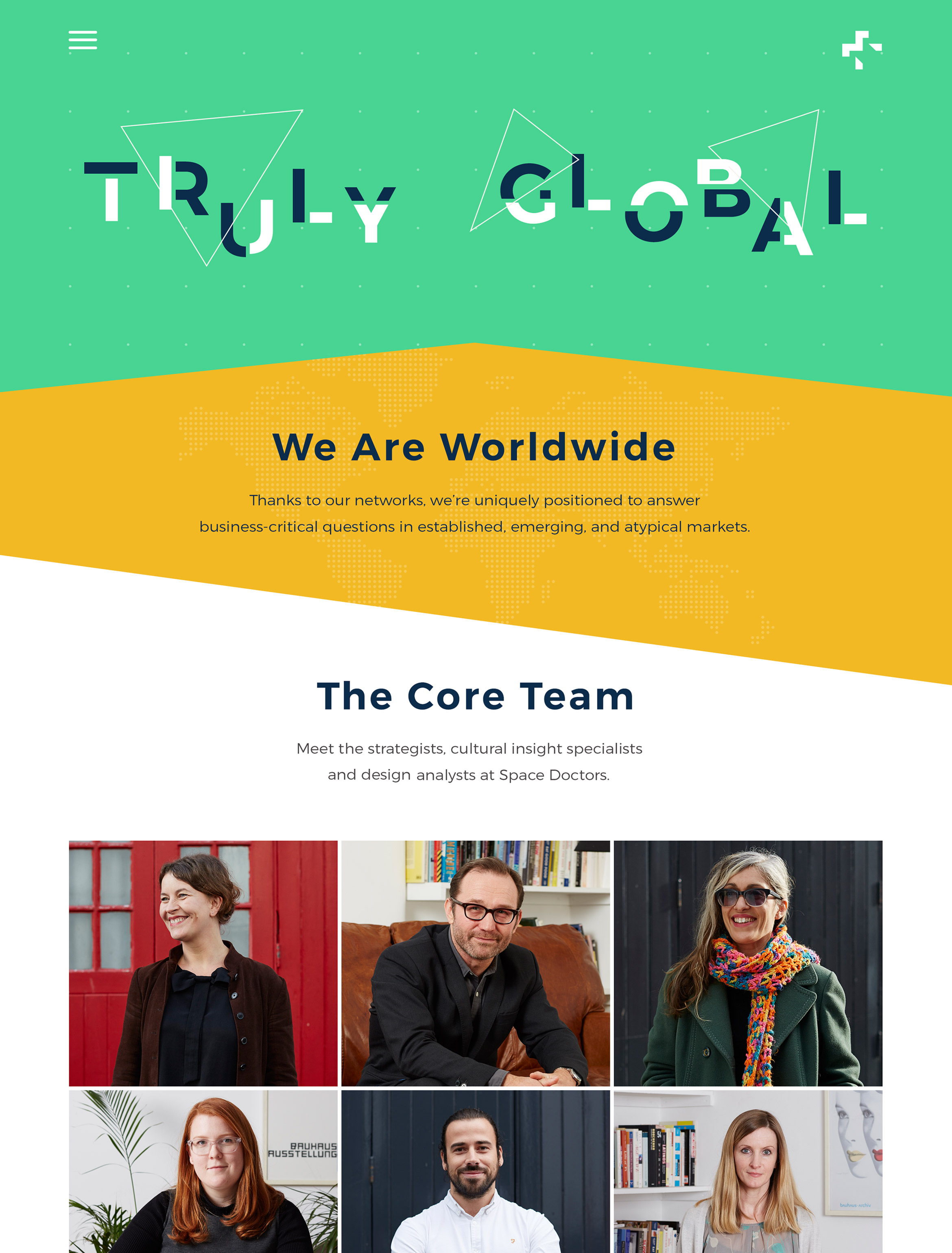
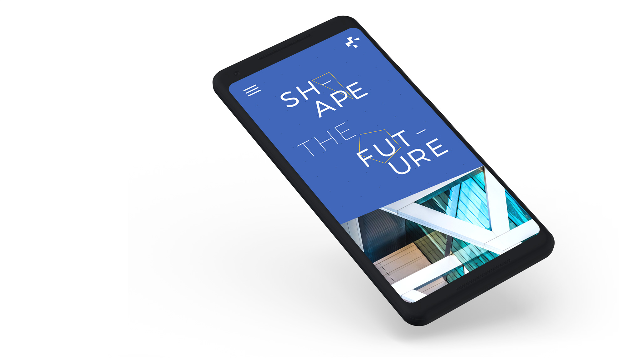
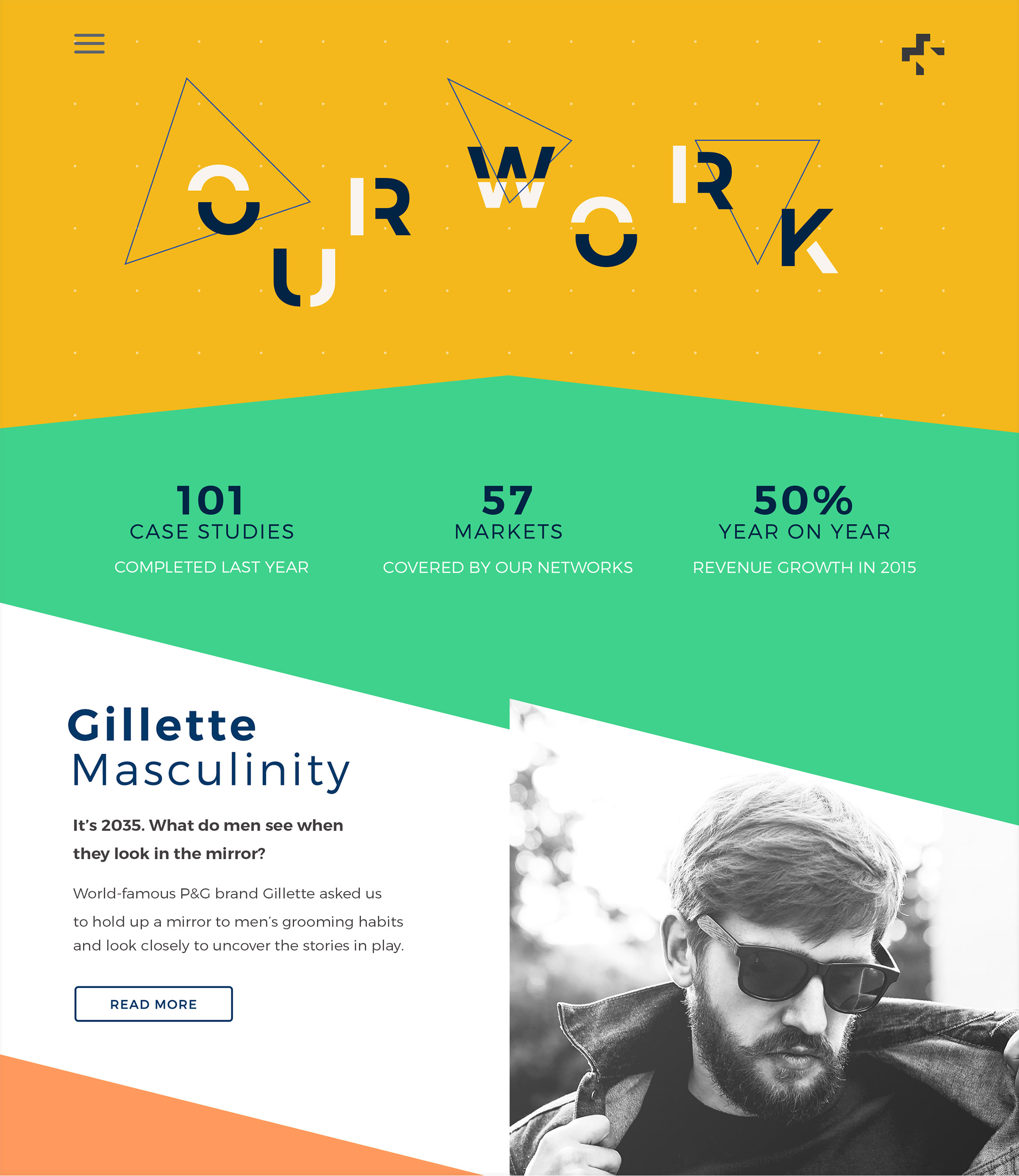
We wanted the Space Doctors brand to be dynamic, adaptable, flexible and above all surprising – to reflect their rebelliousness within the semiotics industry.
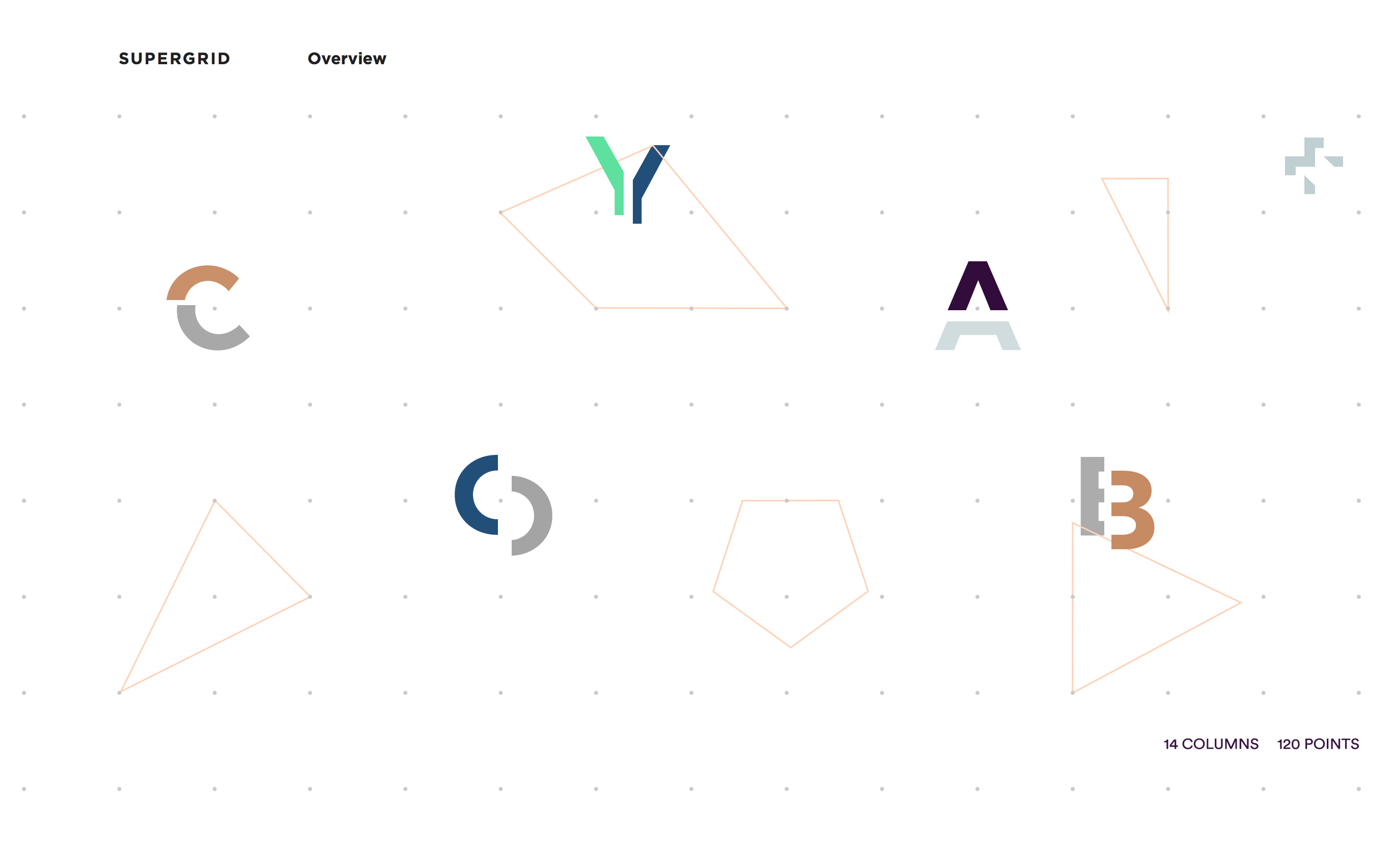
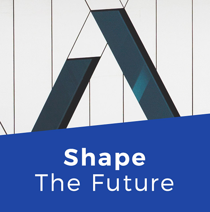
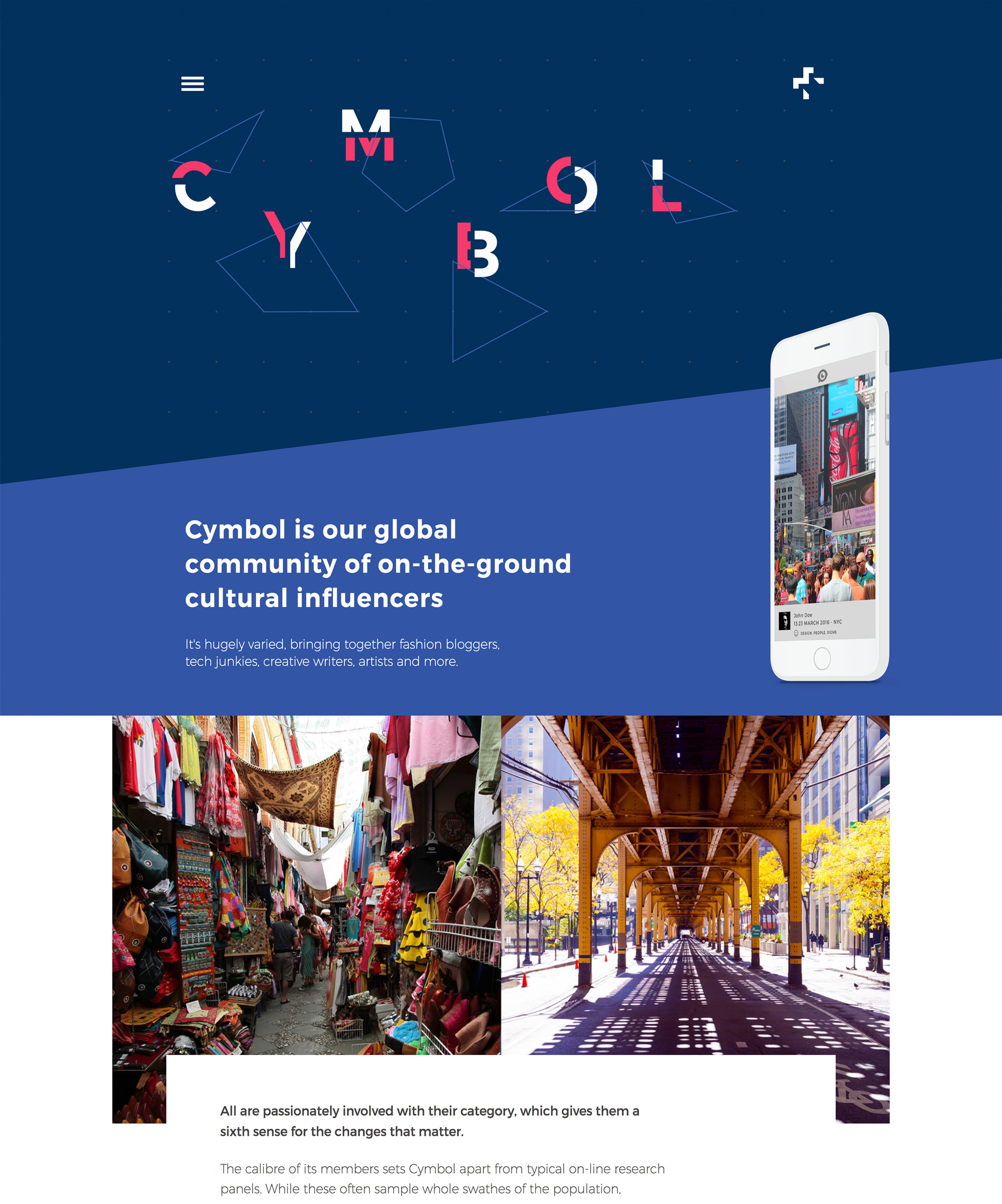
Experimenting with shapes and forms allowed us to create a visual language which captured their spirit of exploration coupled with a minimalist approach.

Finding order
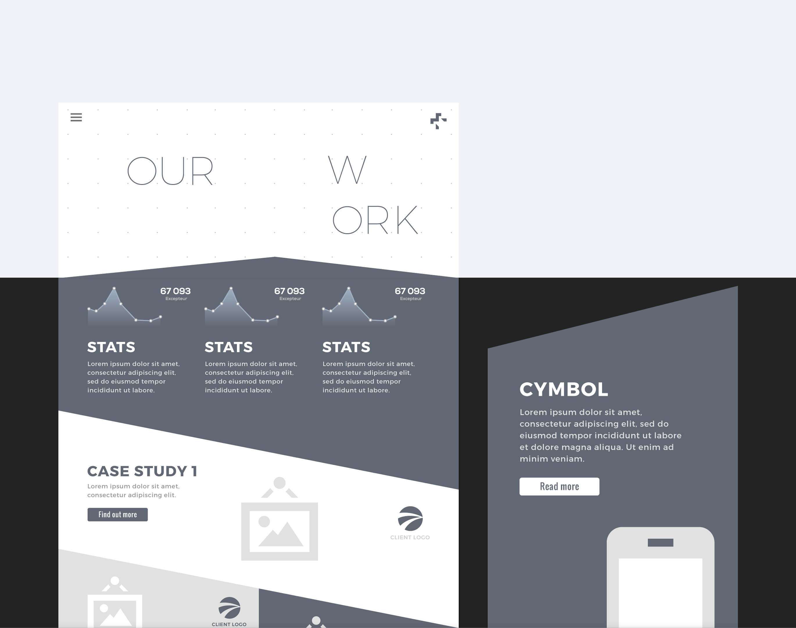
We utilised a grid called the Supergrid, based on a points system to underpin the visual style. This allowed us to bring order to the design whilst keeping a sense of imagination and unexpected twists throughout the experience. We utilised the grid early on in the design process from the initial wireframes to structure the designs.

Capturing the atmosphere
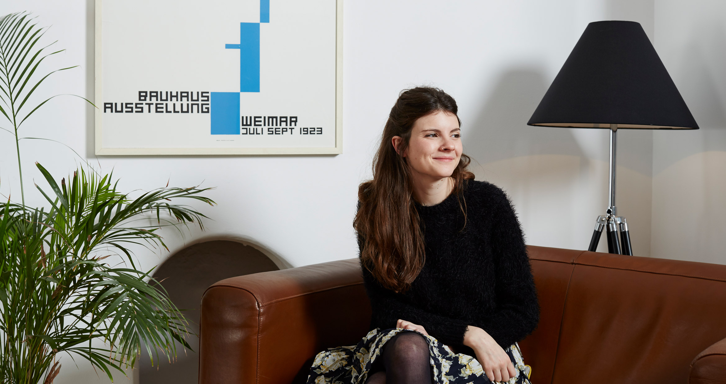
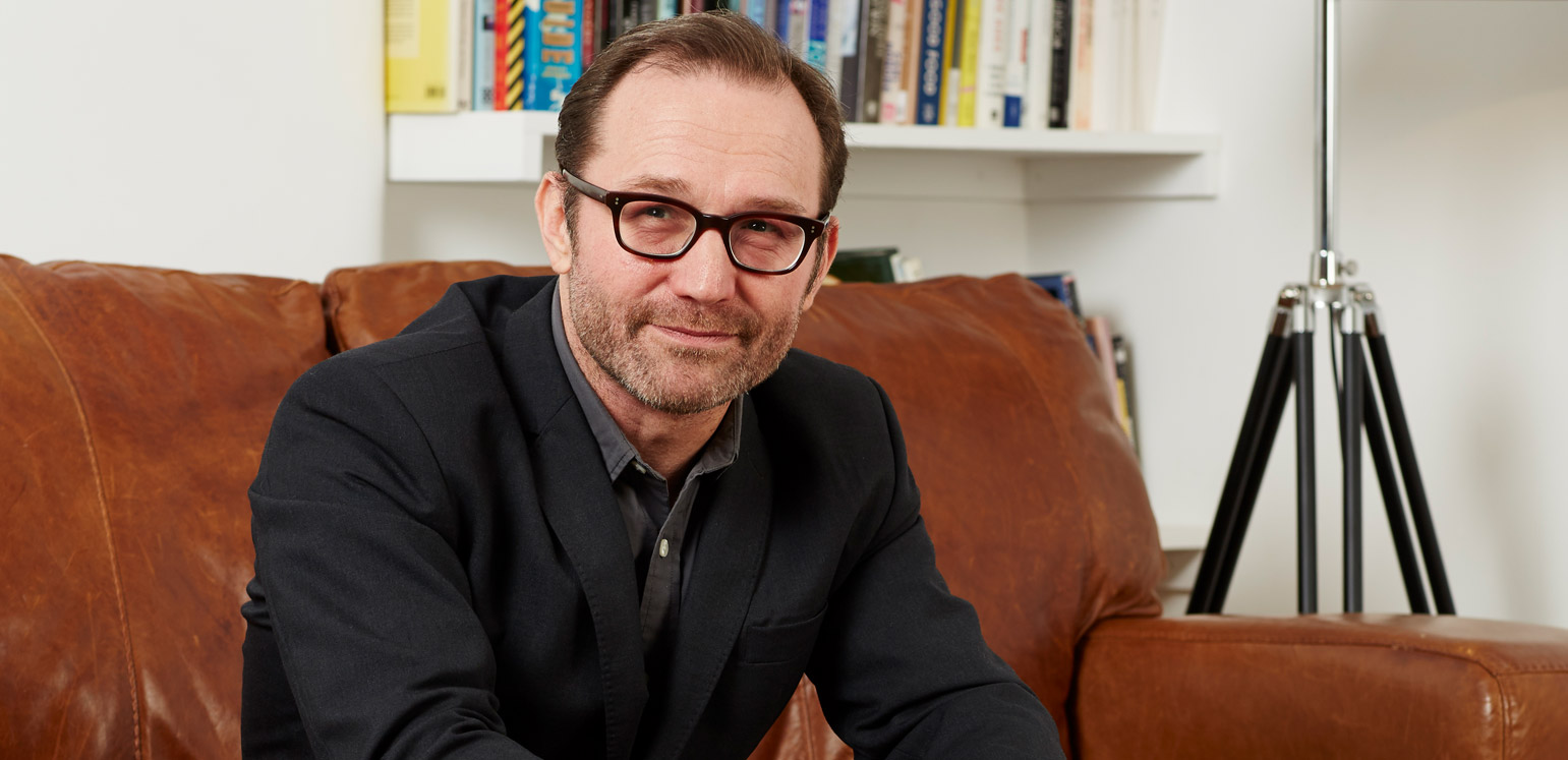
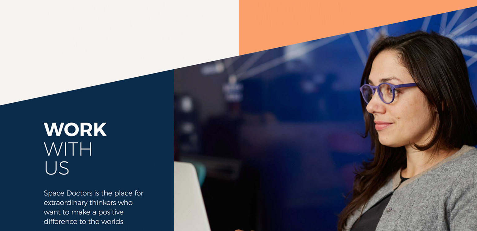
We commissioned photography of the Space Doctors team in their natural habitat. This helped us to capture the essence of the team spirit which fed back into the design process and helped us to capture the organisation’s personality.

Rolling out
Once we had a visual style and underpinning system in place, realising our vision was the next step in the design process.
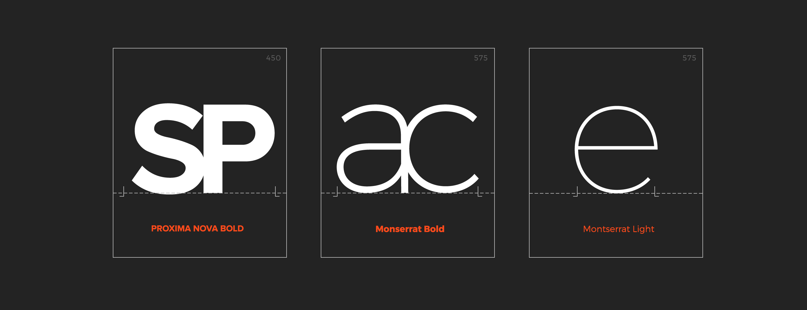
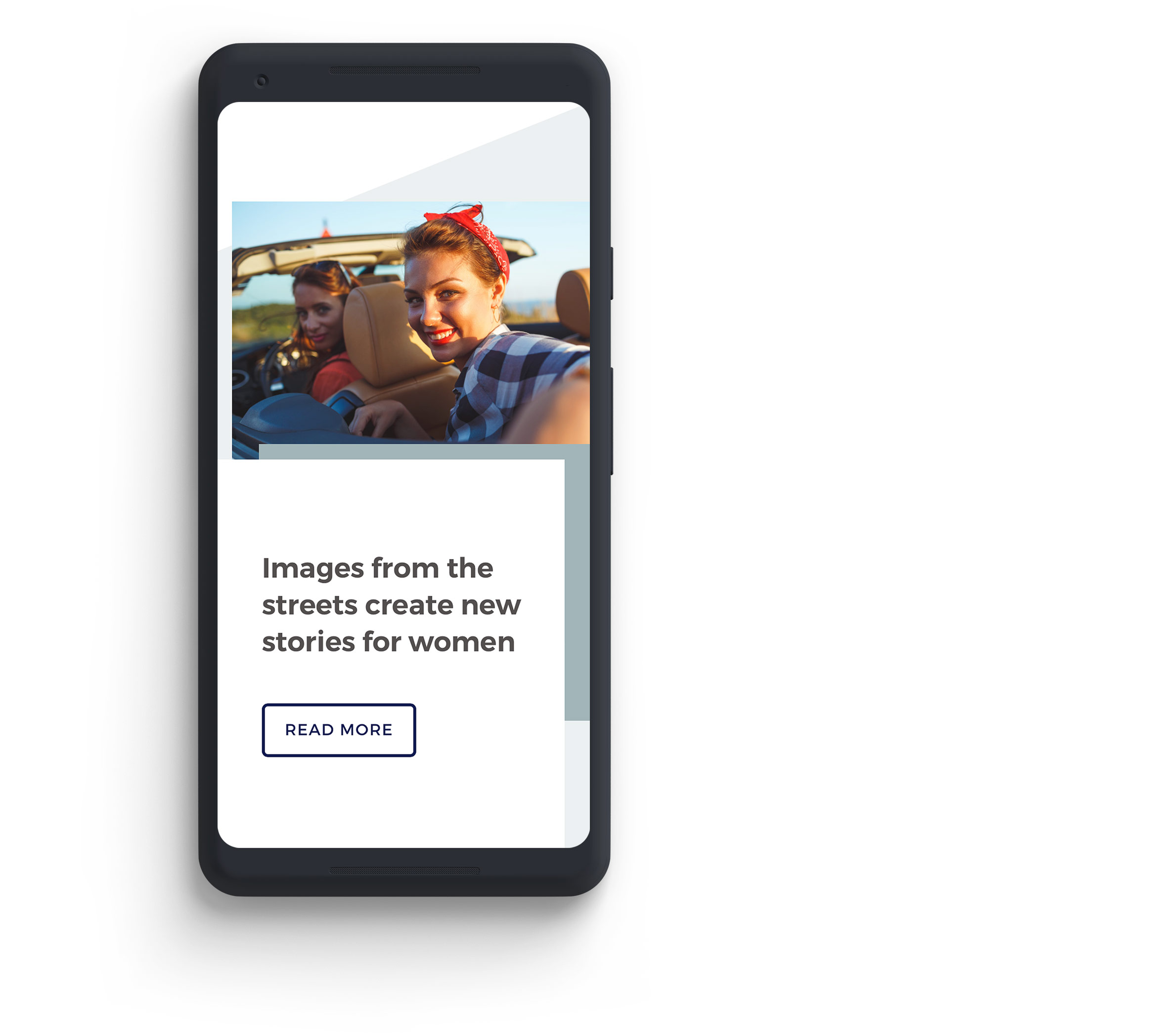
We defined a versatile colour palette combined with the use of bold typography and strong imagery to bring the experience to life.
The Result
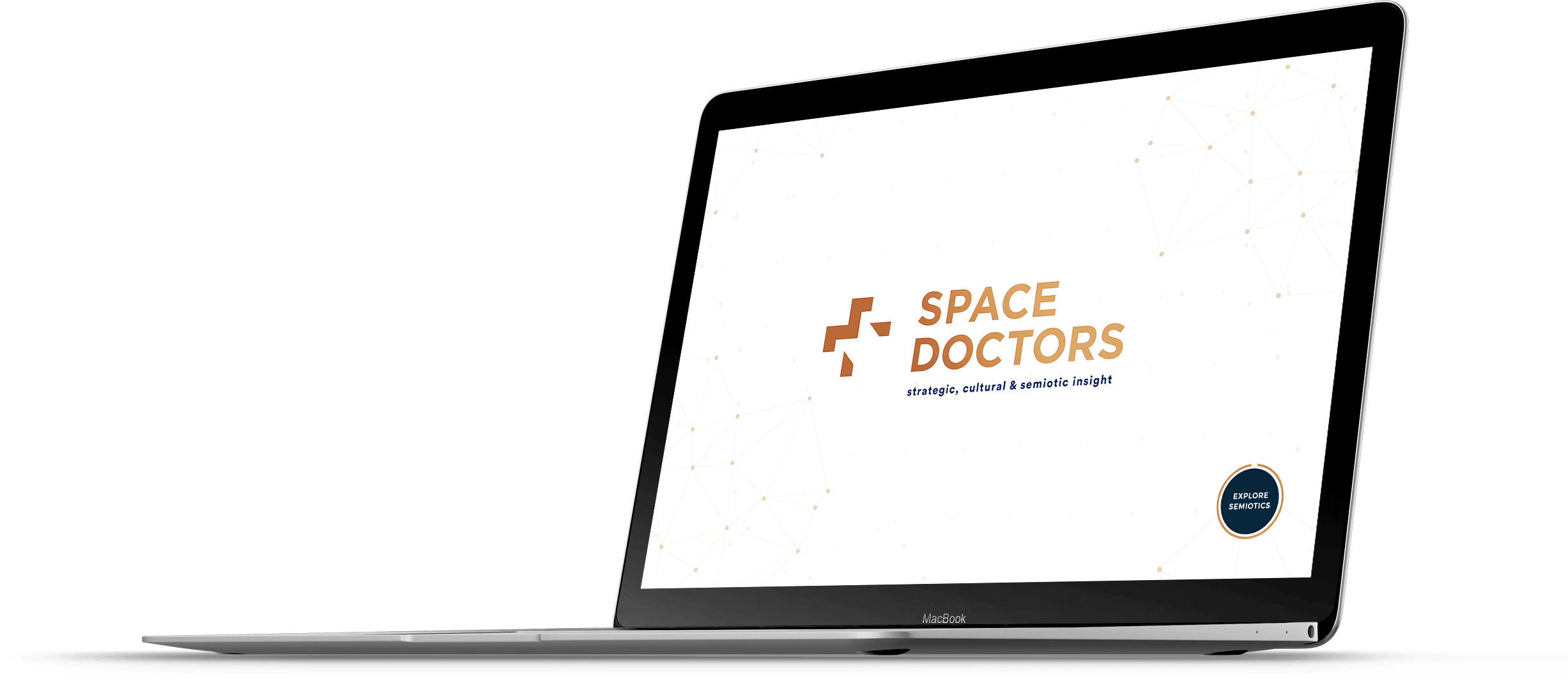
We delivered a website to Space Doctors bursting with personality, that reflected their maverick personality and academic approach.
Since the sites launch Space Doctors have received an overwhelming amount of positive feedback from their clients; not only is the new site much easier to navigate but they can now properly understand what Space Doctors have to offer them as a business.
Wolfcub are a tight, talented, trustworthy team with a proven track record and an abundance of bold ideas.
Gareth Lewis- Director, Space Doctors